One of you saves colorful flowers. The other wants a quiet room. Looking through more wallpapers can feel pointless if every design gets an immediate yes from one person and a no from the other.
Before starting another search, look at one of the rejected designs together. Which part caused the disagreement? A floral subject, bright color and strong contrast are separate choices. You may disagree about only one of them.
Find out what “too much” means
Ask the person who wants a quieter wall to point to the detail they would change. It might be the saturated red, the number of small flowers or the sharp outline of every petal. Each answer leads you toward different wallpapers.
Then ask what the other person most wants to keep. If it is the shape of the flowers, you can look for a less colorful floral design. If it is the color, the flowers themselves might be negotiable.
Avoid turning “I don't like this wallpaper” into a rule against a whole category before you know the reason. It is much easier to find another design when you have one clear quality to preserve and one to change.
Keep the flowers, soften the contrast
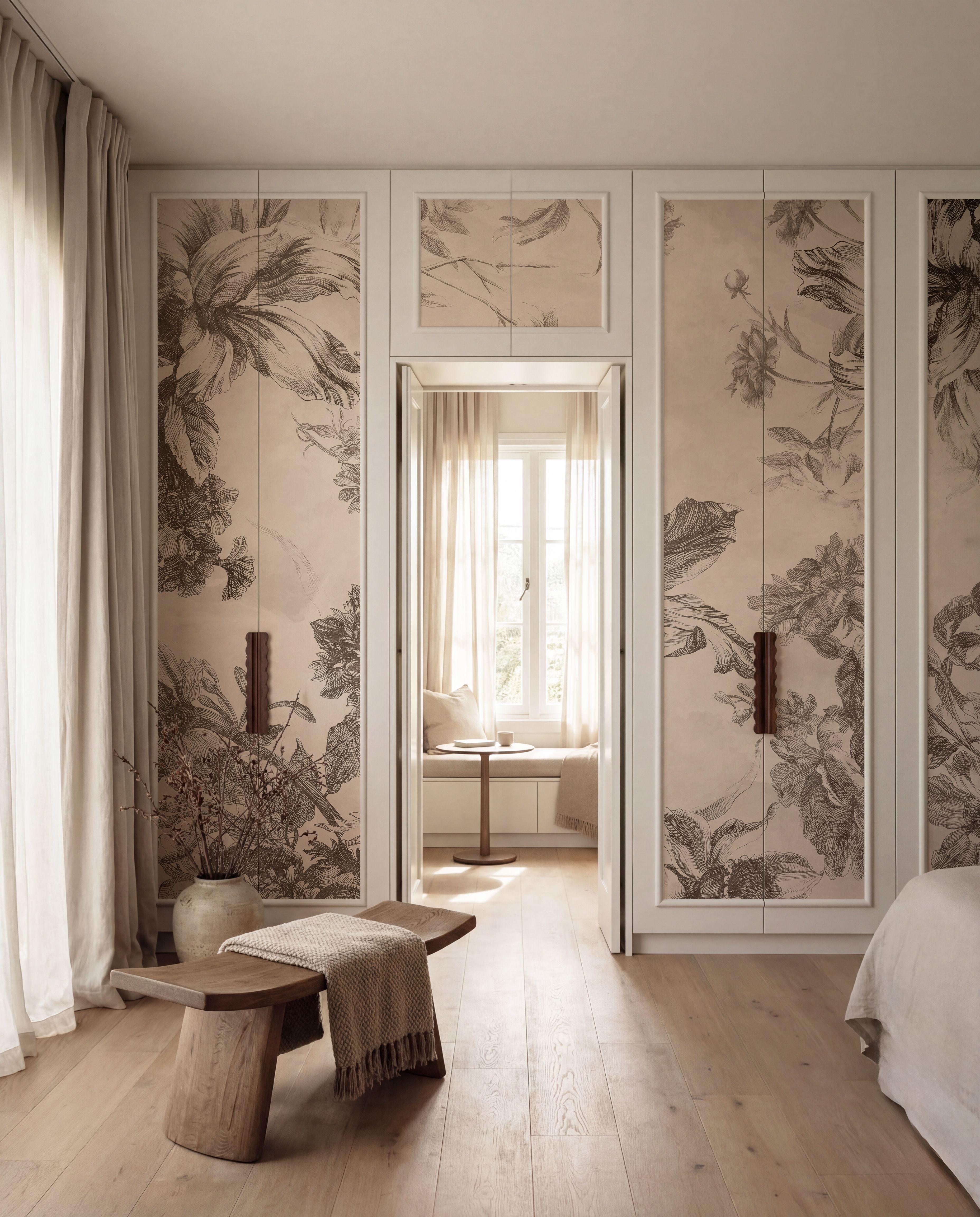
Transcendent Peony, Cream has large pale flowers defined by gentle differences in tone. The floral forms remain visible, with much less color contrast than a bright bouquet on a dark ground.
This is worth comparing if one person wants recognizable flowers and the other objects to a busy palette. Look at the petal shapes together. Do they retain the part of a floral design that you love? Does the pale treatment resolve the specific objection?
If the dislike was of flowers themselves, changing their color is unlikely to settle it. Move to another subject rather than presenting several more pale peonies.
Keep the pattern, limit the color
Perhaps one person wants a patterned room while the other likes the existing neutral scheme. Gingham Sand adds a beige and off-white check without a vivid new color.
The point of comparing it is to test whether a repeat can satisfy the wish for detail within the palette you already share. It will not suit someone whose main wish was a big painted landscape. Be clear about which preference the alternative actually meets.
For the opposite disagreement, where the color is welcome but the subject is not, try Indigo Ocean . Its abstract blue washes give you strong color without a field of flowers or a detailed city scene.