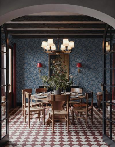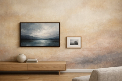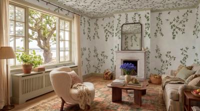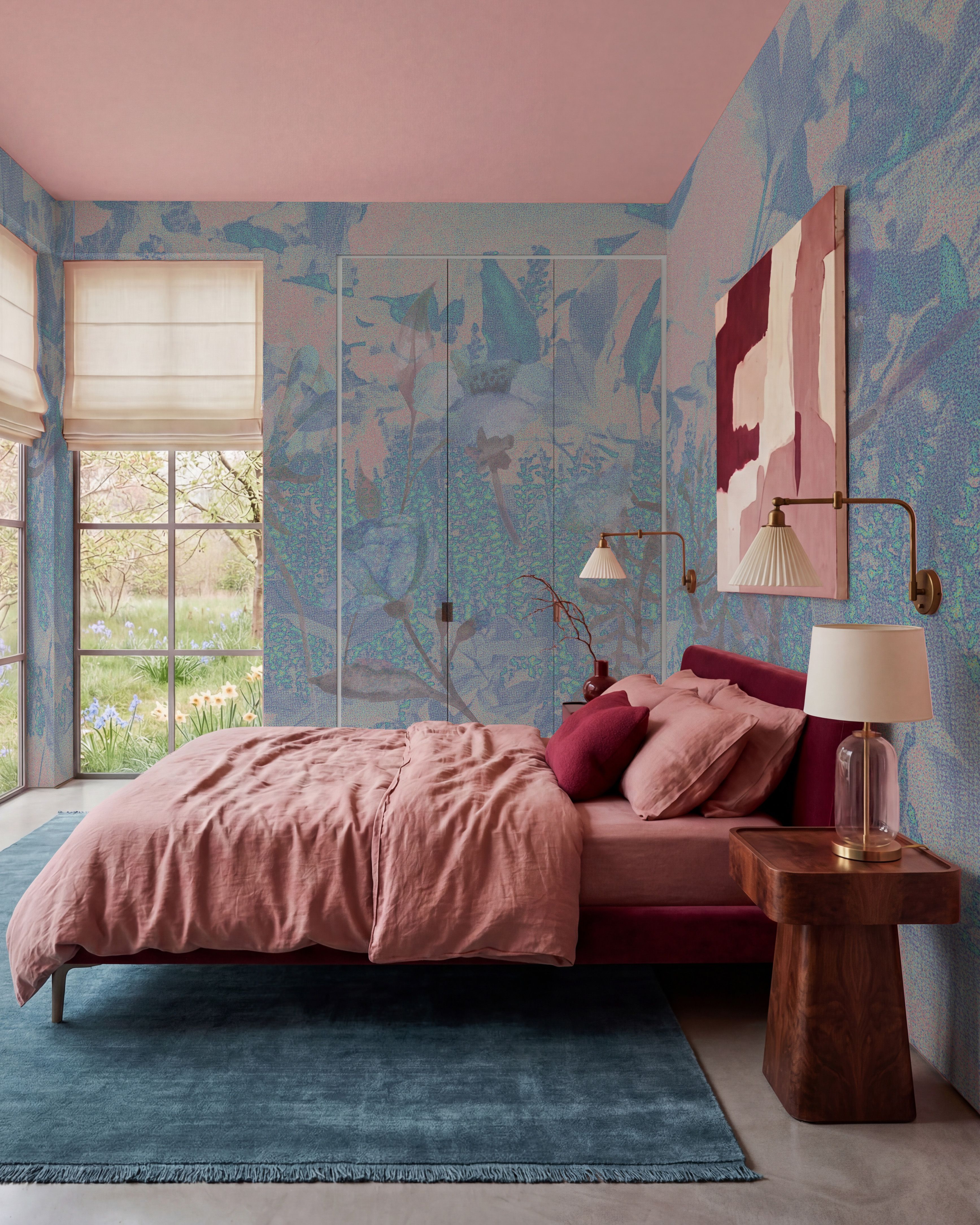
If you already love your patterned curtains, choose the wallpaper with them in mind. Two patterns can work together without being a matching set. The most useful connection may be a color they share, while the drawings remain quite different.
These three pairings give you different ways to work with the fabric you already own.
Floral curtains with a painted stripe
A curtain covered in flowers already gives the room a recognizable subject. A stripe adds a different shape and can make the combination easier to read.
If the curtain has blue in the flowers or background, Watercolor Stripes Indigo is worth considering. Its painted bands keep some variation in the drawing, so you are combining two designs that both have a softer edge.
Compare the widths. Small flowers beside very fine stripes can look busy close up. A broader stripe beside those flowers gives you a clearer difference between the two. You want to notice the separate patterns, rather than have them merge into a similar level of detail.
Checked curtains with loose painted flowers
A checked curtain has a regular structure. A floral design such as Colorful Garden I introduces a looser drawing beside it.
Pick one color in the curtain to connect with the wall. It might be a green line in the check or the curtain's pale background. You do not need the flower colors to match every line in the fabric.
This is also a useful way to judge a combination with several colors. If the check is already strongly colored, keep another large surface plain. A sofa in one color will give the fabric and wallpaper a less complicated setting.
A strong curtain pattern with a gentle check
When the curtains are the design you most want to notice, Gingham Sand offers a softer background pattern. Its beige and off-white check is easiest to combine with a curtain that has a related warm pale color.
The wallpaper can still be visible as a pattern without repeating the curtain's flowers, leaves or other shapes. Look at the curtain's background as well as its colored details. A cool bright white fabric may look quite different beside a creamier wallpaper, even when both seem neutral on their own.