


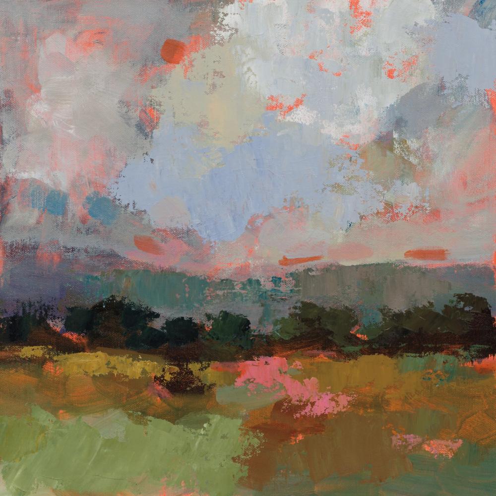
Our Sunset Hues I wallpaper brings an expressive, painterly landscape directly into your room. Created by artist Silvia Vassileva, the artwork blends broad, textured brushstrokes across an expansive sky of soft blues, grays, and muted pinks, punctuated by warm coral and orange highlights. Along the horizon, dark green and deep tones suggest distant trees and foliage, grounding the composition above an earthy foreground mixed with greens, warm browns, and subtle blush notes. As a custom wall mural, it balances vibrant color with an impressionistic atmosphere, printed made-to-measure on our PVC-free paper with a subtle physical surface structure.

Wallpaper - Sunset Hues I
Available as
Premium
Our classic, go-anywhere premium paper
- Matte finish
- Paste application
- Easy to install
Popular choice $4.90 per square foot
Premium Textured
Our most luxurious paper with a slightly textured surface
- Textured matte finish
- Paste application
- Easy to install
Peel & Stick
Our premium self-adhesive paper with a matte finish
- Matte finish
- Self-adhesive
- Removable and easy to install
Always with Wallism
Won’t fade in sunlight
Non-glare
Eco-friendly and 100% PVC-free
Fire rated Class A
Non-woven material
Product info
Name
Sunset Hues I
Design by
Silvia Vassileva
Type
Mural
Wallism ID (MPN)
0dXPnKX4NLyz
From $41 ($4.10 per square foot)
2 days left! - Save 15% with code WALL15
Enter wallpaper dimensions
 No extra fees, tariffs or surprises
 30-day money-back guarantee
 Free shipping
 Ships within 2-5 days
Wallpaper sample
$3 Printed on our premium wallpaper
 Scaled to show the actual image Free shipping
 Delivery time 6-11 business days
Loading ....
Loading..
How Wallism works

Choose your design
Pick a design from our collection of wallpaper murals.

Measure your wall
Measure your wall and enter the full width and height to see your price.

We produce and deliver
After a review, we produce your order and ship it within 2-5 days.
Loading ....
Loading..