


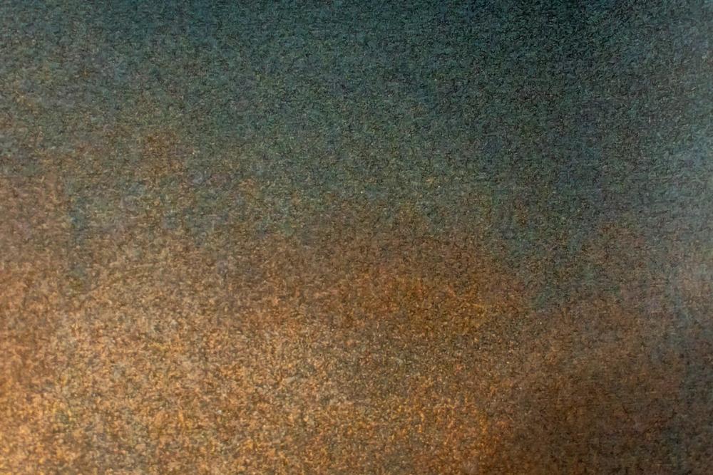
Our Oxidized Dusk wallpaper brings a rich, atmospheric gradient of patinated tones into the home, blending deep charcoal and dusky slate green at the top with warm copper, rust, and burnished amber below. What we particularly like about this design is its fine granular visual texture, which gives the impression of weathered metal catching the last warm glow of sunset. The subtle shift between cool and warm tones creates an earthy, grounded presence without requiring a defined figurative motif. Like all our wall murals, it is produced made-to-measure on PVC-free paper with a subtle surface structure that makes it easy to hang.

Wallpaper - Oxidized Dusk
Available as
Premium
Our classic, go-anywhere premium paper
- Matte finish
- Paste application
- Easy to install
Popular choice £42 per square metre
Premium Textured
Our most luxurious paper with a slightly textured surface
- Textured matte finish
- Paste application
- Easy to install
Peel & Stick
Our premium self-adhesive paper with a matte finish
- Matte finish
- Self-adhesive
- Removable and easy to install
Always with Wallism
Non-glare
100% PVC-free
Fire rated Class A
Non-woven material
Product info
Name
Oxidized Dusk
Design by
Wallism Portfolio
Type
Mural
Wallism ID (MPN)
lNvL4yOVKOWKZ
£35 per square metre
BLACK FRIDAY WEEK - Use code BW20 for 20% off
Enter wallpaper dimensions
 Made in Sweden
 30-day money-back guarantee
 Free shipping
 Ships within 2-5 days
Wallpaper sample
£3 Printed on our premium wallpaper
 Scaled to show the actual image Free shipping
 Delivery time 6-11 business days
Loading ....
Loading..
How Wallism works

Choose your design
Pick a design from our collection of wallpaper murals.

Measure your wall
Measure your wall and enter the full width and height to see your price.

We produce and deliver
After a review, we produce your order and ship it within 2-5 days.
Loading ....
Loading..