
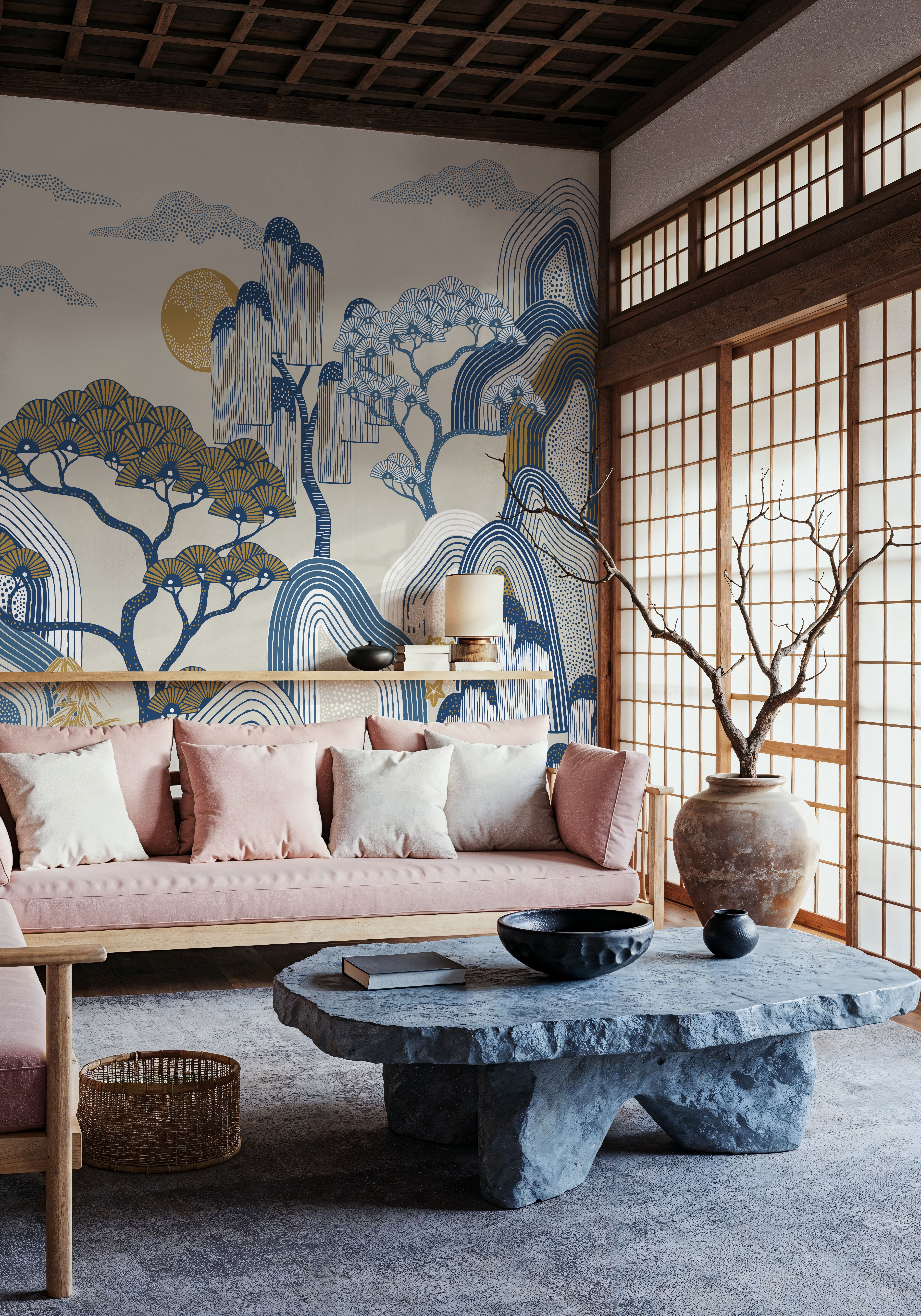
Should the wallpaper be a subtle backdrop for your furniture or give your Japandi room a whole landscape to focus on? Compare soft grasses with a more graphic mountain scene and consider what will remain visible above the sofa, sideboard or bed.
A nature scene can be the room's one large image
Whispers of the Mountain, White is among the most ordered designs in our Japandi collection. Layers of mountains meet stylised trees, blue details and a golden sun. We would choose it as the room's main picture in an otherwise sparsely furnished interior.
We would give it an uninterrupted wall and let the composition show above a low sofa, sideboard or headboard. On a wall with tall bookcases, far less of the landscape will remain visible. Start by choosing the surface that can show the parts of the image you like.
Try the wall's proportions in the preview. Look at where the mountain lines and trees sit when the image is adjusted to the width and height. A narrow wall may show a different part of the composition from the wide product image.
Then choose the wallpaper whose role feels right for the room. If you want a whole scene, give it space. If you want a softer wall behind the furniture, start with the colour transitions and what will show above it.
A quieter wall can still have a design
If you want something softer, Meadow Grass may be a better starting point. Grasses and thin stems grow up from the lower part of the image, while the background becomes more open higher up. The colours are close to beige and light brown.
Here, we would pay particular attention to furniture height. A tall cabinet may cover much of the grass. A lower piece of furniture gives more stems room to show and leaves the quieter upper part of the wall visible above it.
This is an option if you want a visible nature design with less colour contrast. Compare it with the full image of Whispers of the Mountain. You will see the difference between a softer background and a more graphic composition.
Choose both the undertone and the contrast
Beige wallpaper can lean towards pink, yellow or grey. Order a wallpaper sample, a small printed piece of wallpaper, to compare the shades with your floor and furniture at home. Hold it beside the floor or a wooden cabinet and see whether you like the combination. A warm wooden floor does not automatically call for beige wallpaper.
For more contrast, you can pick up a dark detail in the design with a similar shade in a lamp or piece of furniture. A few connections like this are often enough to make the colours feel at home in the room. You do not need to repeat every wallpaper colour in the furnishings.