
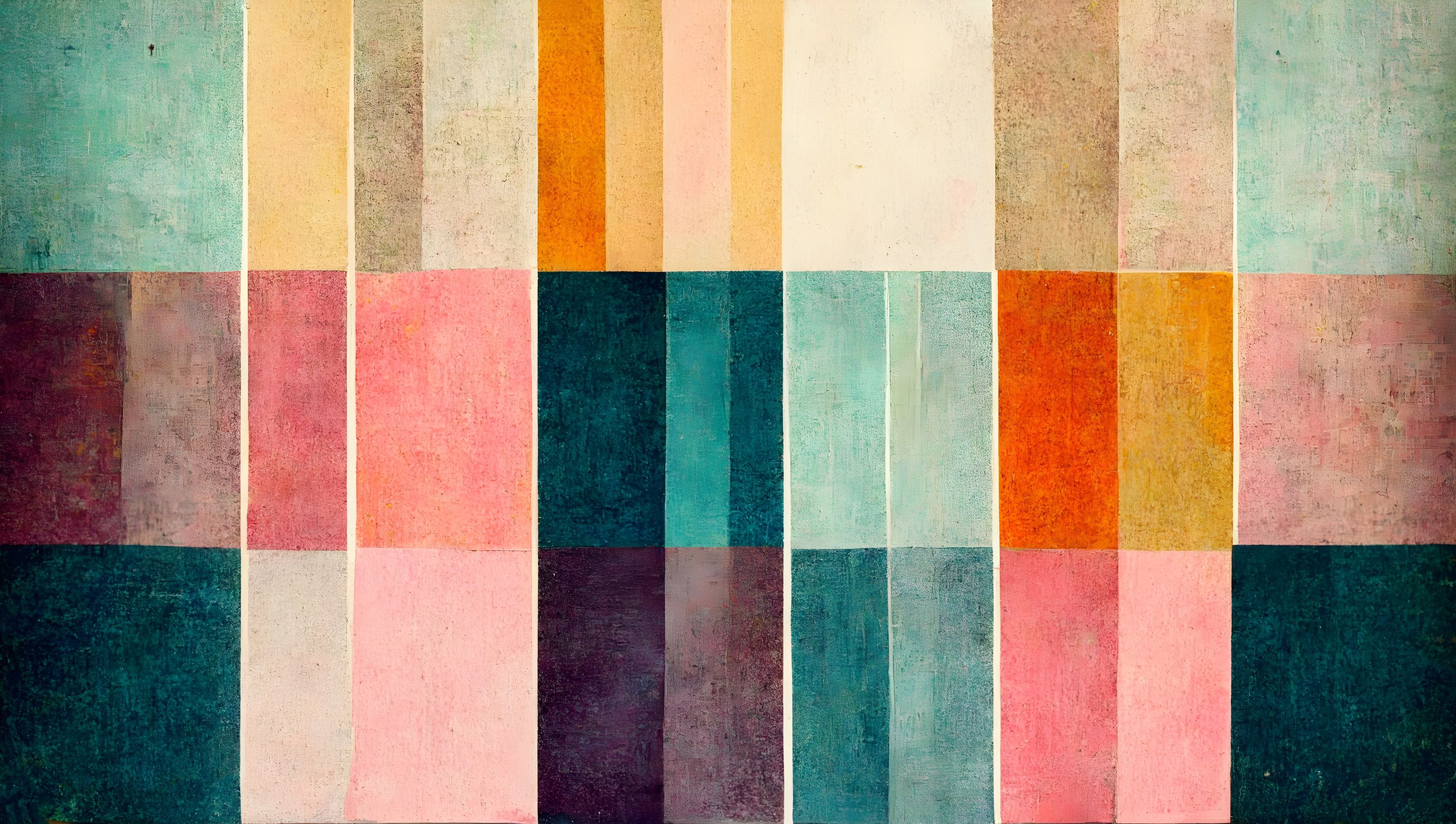
For a mid-century-inspired interior, choose large areas of colour as the room's main colour accent or circles and semicircles for a denser graphic rhythm. Compare the designs with your wood tones and textiles, then check how much wall will show around the furniture.
Large areas of colour give the wall a clear role
Color Block Study is one of our most ordered geometric designs. Rectangular areas in teal, plum, ochre and orange, among other colours, form a painted composition. The colours are distinct, while the brushstrokes make the surface feel less rigid.
We would choose it when the wall is to be the room's main source of colour. A low sideboard leaves plenty of the coloured areas visible above it, and a desk can have a distinct backdrop without adding more pictures there.
Try the full wall dimensions in the preview and see which areas sit closest to the furniture. You can move the image to choose the composition. This is particularly useful if you want to keep a certain orange or teal section.
The samples for these wallpaper murals show reduced images, so use them for colours and the preview for the size of the shapes. Choose Color Block Study as the room's main colour accent and Bauhaus Geometric, Green for a denser graphic rhythm.
Circles and semicircles create a different rhythm
Bauhaus Geometric, Green has circles, semicircles and lines on a green background, with blue and mustard yellow details among its colours. It is our choice when you want more small shapes to look at, rather than letting large blocks of colour dominate the wall.
We would choose these two contemporary designs from our collection for a mid-century-inspired interior because of their shapes and colours.
To give the geometry a clear place, start with a feature wall. Check how much of it will remain visible with the furniture in position. A tall bookcase breaks up the design more than a low sideboard does.
Choose one colour to start with
If the room already has plenty of teak or other warm wood, try wallpaper with green or blue shades for a clearer contrast. To keep the overall look warmer, start with ochre or orange in the design. Before deciding, you can order a small printed piece of wallpaper as a sample to see how its colours work with the wood at home. Hold the sample beside the wood and compare them in the room's usual light.
Then repeat one or two colours from the wall elsewhere if you want to bring the room together. A mustard yellow lampshade or a blue detail may be enough. The wallpaper can carry more colours than the furniture.