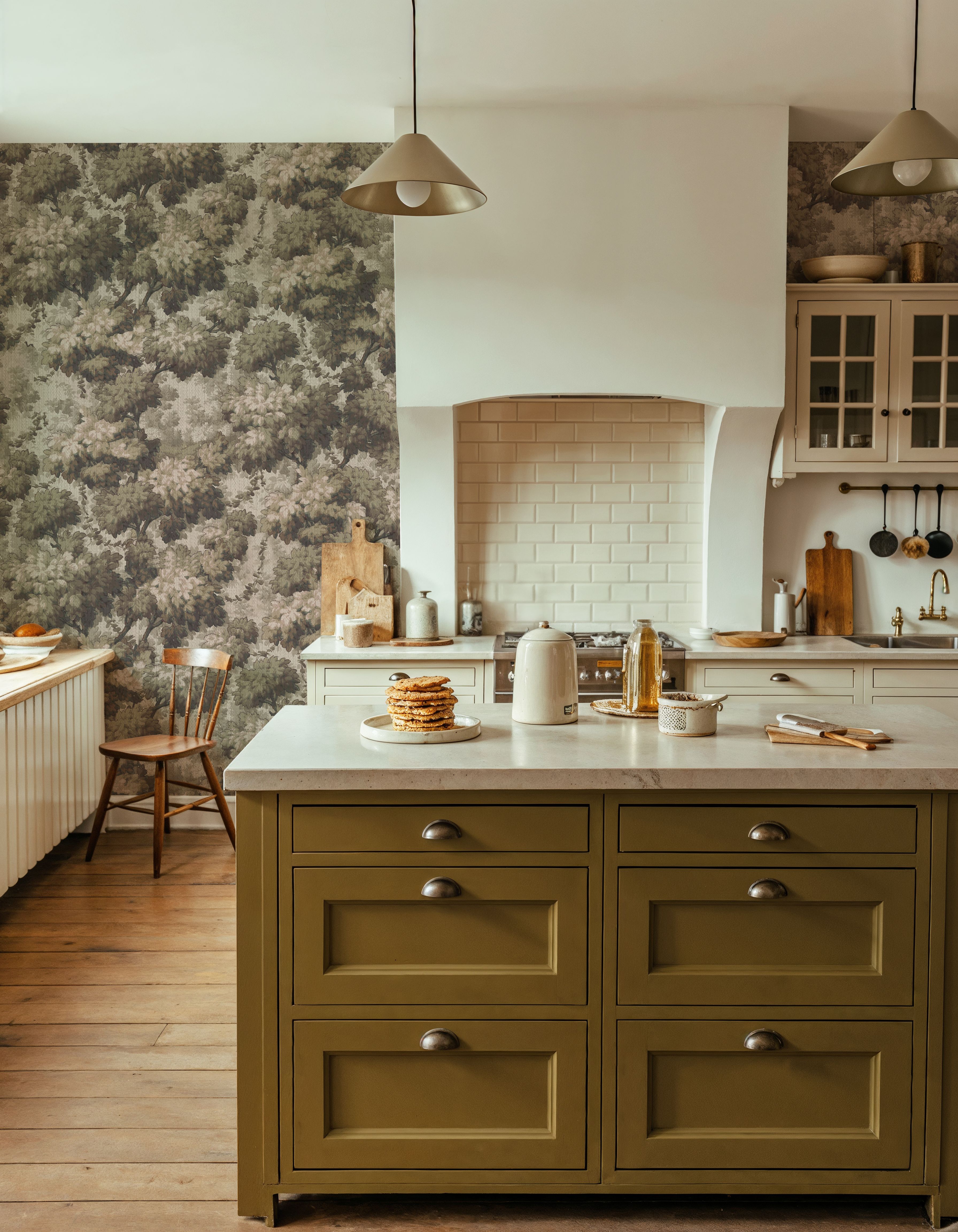
What paint colour goes with your wallpaper?

Once you have chosen the wallpaper, the paint needs a more specific job. It might continue the background onto another wall, pick up a smaller colour in the design or give a door a stronger outline. You can get very different rooms from the same wallpaper by changing which of those jobs you choose.

Here are three ways to build a palette around a design.

A pale background for a room with continuity

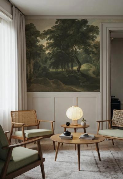
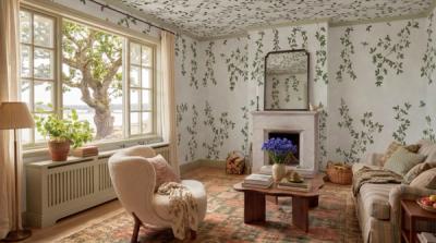
With Magnolia Season , the pale blue behind the white flowers is the largest continuous colour. Taking a related powder blue onto the neighbouring walls would make that background continue through the room.

Soft white woodwork keeps the pale colours together. Brown or natural wood furniture picks up the warmth of the branching stems, while blue remains the main colour across the walls.

The important distinction is between extending a background and matching a small petal. A pale flower colour on every other wall will create a greater break around the wallpaper, even though that colour appears in the design.
The important distinction is between extending a background and matching a small petal. A pale flower colour on every other wall will create a greater break around the wallpaper, even though that colour appears in the design.
A warm neutral when the wallpaper carries several colours

Pumpkin Poppies I has orange and yellow flowers against cream. A warm off-white on the other walls continues the background. One of the stronger flower colours can then go on a smaller painted surface.

For example, an off-white wall, a muted orange cabinet and simple cream woodwork give the flowers some company without repeating orange everywhere. If the cabinet is large, choose a softer version of the orange. You can use the wallpaper colour as a direction without needing to reproduce its brightest point exactly.

That approach is particularly useful when the room already contains warm wood. The neutral paint connects with the background, leaving you fewer strong colours to manage at once.

Dark paint for a more enclosed effect

Purple Perplexed has vivid flowers on a dark ground. Deep charcoal on the neighbouring walls would continue that depth. A small plum or amber detail could draw on the flowers without competing with all their colours.

If you want more separation around the wallpaper, compare the same design with a warm stone-coloured paint. The painted walls will become more noticeable as their own surfaces. Neither version requires you to change the wallpaper, but the difference in the room can be substantial.

Choose between those effects before looking for an exact paint shade. It narrows the decision considerably.

Make the final match against the printed wallpaper

An image on a phone is useful for assembling possible palettes. The final colour match needs printed wallpaper and actual paint. A small printed wallpaper sample lets you put the two materials beside each other before installation.

Apply your paint tester to a movable board and hold it beside the paper on the wall. Look at it in daylight and with your usual lamps on. Include the existing floor or trim in the view, too. A colour that matches the design closely can still be the wrong paint for the other surfaces in the room.

Before you buy the full quantity of paint, leave the tester beside the wallpaper long enough to see both in the conditions you normally use the room.