Same wallpaper, different colour: how to choose a colourway

You have found a wallpaper you love, then noticed it comes in several colours. The drawing may have won you over, but the version you choose can change what you notice first. A green woodland, a blue woodland and a sepia woodland give the same subject very different company in a room.

Our Historic Lands collection makes that difference easy to see. Compare the colour variations as complete images before deciding which belongs in your home.

Green brings the trees into focus

In Historic Lands, Forest Green , the foliage has mossy and olive tones, with earthy browns beneath it. The trees feel like the main subject. If you love the idea of a woodland wall, this is the most direct of the three choices.

It is a good place to begin with warm wood and plain cream upholstery. Those materials leave the greens visible without asking every item in the room to be green, too. A brown leather chair could connect with the earthier parts of the scene.

Look at the balance of light and dark within the whole image. A green label tells you much less than seeing where the foliage becomes dense and where the sky opens up.
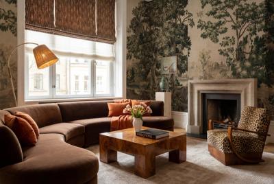
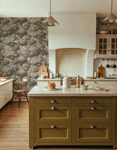
Open the variations beside one another at the same size. Notice the largest pale area in each, then the deepest colour.

Blue changes the atmosphere of the scene

Historic Lands, Washed Blue treats the woodland in softened blue and grey tones. The trees are still recognisable, but the palette gives the scene a more distant, misty appearance.

Try this version if you like the landscape and want a cooler palette. Beside pale grey curtains, it can continue a restrained combination. Beside golden wood, the blue creates a more noticeable contrast. Decide whether you enjoy that contrast before adding blue accessories to make everything match.

The important comparison is between the wallpaper and the largest existing colours. A small blue cushion is easy to change. The oak floor or stone fireplace will have much more influence on how the blue reads.

Sepia lets the drawing do more of the work

Historic Lands, Sepia uses warm brown tones against a cream, parchment-like background. There is less difference in hue between the parts of the woodland, so the shapes of the trees and the light areas become easier to appreciate as a tonal drawing.

Consider it when you want a landscape but have little appetite for another strong colour. It can sit beside a collection of differently coloured books or artwork without introducing green foliage or blue sky as an additional palette to manage.

Sepia is still a visible scene. Choosing a quieter colour version does not turn a detailed landscape into a plain wall.

Compare the background, not just the favourite detail

Open the variations beside one another at the same size. Notice the largest pale area in each, then the deepest colour. Those two parts give you a better sense of the finished wall than a close view of one branch.

Put each version beside a photograph of the room you have. Keep the floor, sofa and curtains the same in every comparison. Once one palette looks right with those surfaces, check that you still love the way it treats the woodland itself.