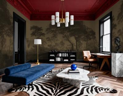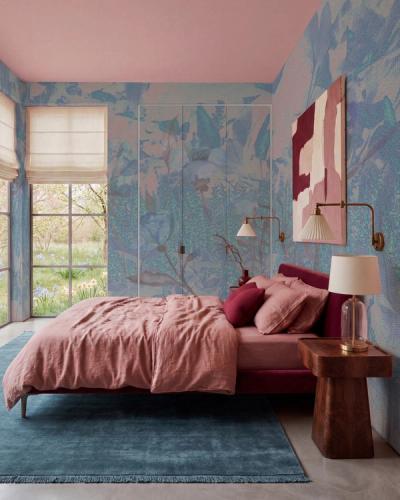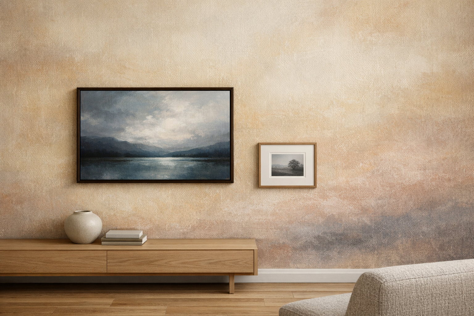
The paintings and prints you already own can stay when you wallpaper a room. The choice is how much attention you want the wall and the framed work to receive. A frame, a mount and the space around a picture can make a bigger difference than finding a wallpaper in exactly the same colours.
Begin with the artwork you most want to see clearly.
Give a detailed picture a simpler immediate background
A small print with fine lines needs some separation from a patterned wall. A plain mount inside the frame creates an area between the picture and the wallpaper, making the picture easier to read.
Choose the mount with the paper in the picture in mind. An off-white print can look unexpectedly yellow beside a bright white mount. The wallpaper adds another colour to that comparison, so consider all three together.
If your artwork already has a narrow frame and no mount, a gentler wallpaper may be the easier route. Soft Abstract Beige has changes in tone without a crisp, regular drawing. Against a background like that, fine details in the print have fewer lines around them to compete with.
One large work can hold its own against a pattern
A painting with broad areas of colour can remain readable on a wall with more detail. Its scale and frame establish a boundary, so it does not need to repeat the wallpaper's subject.
With Watercolor Stripes Indigo , for example, a larger photograph or painting with a simple composition can remain distinct from the repeated line around it.
Several tiny line drawings are harder to place on the same wall. The repeated lines can draw attention away from their finer marks. Try a larger piece from your collection, or give the small drawings more space inside their mounts.